How to create perfect spacing
Spacing is a crucial aspect of design that often gets overlooked or treated as an afterthought. However, proper spacing is essential for creating a balanced and visually appealing design that enhances the overall user experience. In this blog post, we'll delve into the secret science of perfect spacing and explore three laws that can help you achieve harmonious designs.
1. Every Element is Related
The first law of spacing states that every element is related to every other element, even if the relationship is weak. Some elements have a stronger relationship than others, and this hierarchy determines how close or far apart they should be positioned. For example, a heading and a subheading within the same section have a strong relationship and should be positioned closer together, while a heading and a sidebar navigation item have a weaker relationship and can be spaced farther apart.
2. Relationship Strength Dictates Spacing
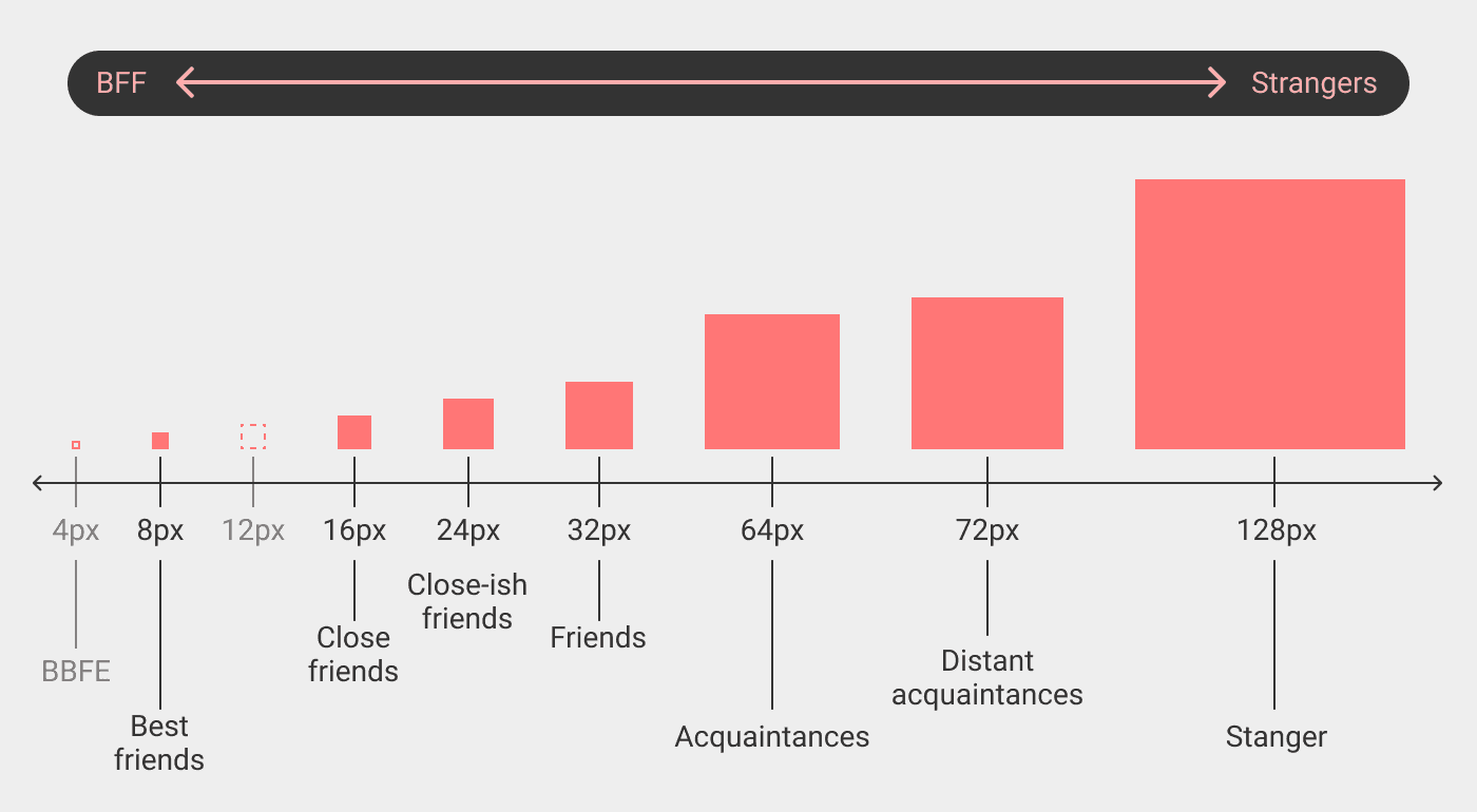
Building on the first law, the second law emphasizes that the strength of the relationship between elements determines the amount of spacing between them. Strongly related elements should be placed closer together, while weakly related elements can have more space between them. This principle helps create visual hierarchy and establishes a clear information flow.
Enjoy the below cheatsheet from this amazing article:

3. Use Preset Spacing Values
The third law suggests using preset spacing values from a scaling system rather than eyeballing the spacing. By relying on a predefined set of spacing values, you can maintain consistency throughout your design and avoid making arbitrary spacing decisions.
Further Reading
Highly recommend this article for further information.
or this article as well.